- Brochure WebsitesProfessional 5-10 page sites
- Web Design PackagesMonthly plans from £69
- Responsive DesignFluid layouts for every device
- E-Commerce DesignStorefronts built to convert
- Product PagesCatalogue & product listings
- Mobile DesignMobile-first experiences
- Landing PagesHigh-converting campaign pages
- Website Redesign
- Case StudiesReal client projects
- Retail & E-CommerceOnline stores & shop websites
- Professional ServicesLaw, finance & consulting
- Hospitality & LeisureHotels, leisure & food service
- Property & LettingsEstate agents & lettings portals
- Trade & ConstructionBuilders, plumbers & electricians
- Industrial & ManufacturingEngineering, logistics & manufacturing
- Web ApplicationsCustom business tools & portals
- E-Commerce DevMagento, Shopify & bespoke
- CMS DevelopmentCustom content management
- Database SystemsBespoke data solutions
- Mobile AppsiOS, Android & hybrid
- Sage 50 IntegrationAutomate your accounts
- SaaS PlatformsMulti-tenant applications
- API DevelopmentRESTful & GraphQL APIs
- Next.js & ReactModern frontend frameworks
- WordPressBuild, fix, host & look after
- Search Engine MarketingRank higher on Google
- Content WritingSEO-optimised copy
- ConsultingStrategic digital advice
- Logo DesignBrand identity creation
- Web HostingDedicated UK servers
- Email HostingProfessional mailboxes
- MaintenanceOngoing support & updates
- Security & SSLKeep your site safe
- Domain RegistrationFind your perfect domain
- Blog & InsightsTips, guides & news
- Free SEO AuditCheck your site health
- AI ChatbotsGPT-powered conversational AI
- AI Voice AgentsAnswer calls 24/7 automatically
- AI AutomationEliminate repetitive workflows
- Custom AI DevelopmentTrained on your business data
- AI IntegrationConnect AI to your existing stack
- AI ConsultingStrategy & honest AI advice
- GPT-4 & ClaudeLatest large language models
- ElevenLabs VoiceNatural-sounding voice AI
- RAG SystemsAI that searches your knowledge base
- CRM IntegrationHubSpot, Salesforce & Pipedrive
- Document IntelligenceExtract data from any document
- Private AI DeploymentYour data never leaves your servers
Responsive Web Design Bristol
We build mobile-first websites that look pixel-perfect on every screen size. No templates. No page builders. Just clean, bespoke code engineered to perform on phones, tablets, and desktops alike.
The Problem
One Website. Every Screen Size.
Over 60% of web traffic now comes from mobile devices. If your website does not adapt to every screen size, you are losing customers every single day. A non-responsive site frustrates visitors and tells Google your business is not worth ranking.
Pinch and Zoom
Users should not have to zoom to read your content on mobile. If they do, they leave.
Broken Layouts
Elements overlapping, text overflowing, images cropped wrong. It destroys credibility instantly.
Google Penalises You
Non-mobile-friendly sites rank lower since Google switched to mobile-first indexing.
Lost Conversions
61% of users will not return to a site that is hard to use on mobile. That is revenue walking away.
What We Build
Responsive Design That Actually Responds
Every website we build starts mobile-first. Fluid grids, flexible images, and intelligent breakpoints that make your site look exceptional on any device.
Mobile-First Design
We design for the smallest screen first, then progressively enhance for larger viewports. This ensures your mobile experience is never an afterthought.
Fluid Layouts
Flexible grids that adapt seamlessly to any viewport width. No fixed pixel widths, no broken layouts between breakpoints.
Adaptive Images
Optimised images that load fast on any connection. We serve the right resolution for every device using srcset and modern formats like WebP and AVIF.
Performance Optimised
Sub-3-second load times across all devices. We optimise every asset, lazy-load below the fold, and score 90+ on Core Web Vitals.
Touch-Friendly UI
Buttons, forms, and navigation designed for fingers. Proper tap targets, swipe gestures, and mobile-optimised interactive elements.
SEO Responsive
Structured markup that Google loves on every device. Mobile-first indexing ready with clean semantic HTML and schema data.
Our Process
From Brief to Launch in Four Steps
- 01
Discovery
We understand your audience, the devices they use, and your business goals. We audit your current site and identify every responsive issue.
- 02
Design
Mobile-first wireframes, responsive breakpoints, and full UI design. You see every screen size before a single line of code is written.
- 03
Build & Test
Bespoke code built to your specification. Tested on 20+ real devices and browsers including iOS Safari, Chrome, Firefox, Edge, and Android.
- 04
Launch & Support
We deploy to our UK servers, monitor performance, and provide ongoing maintenance. Your site stays responsive as new devices hit the market.
"approach": "Mobile-First",
"breakpoints": [
"375px",
"768px",
"1024px",
"1440px"
],
"framework": "Next.js 14",
"css": "Custom + Tailwind",
"testing": "20+ Devices",
"performance": "Sub-3s Target"
}
Our Work
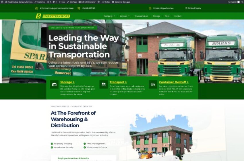
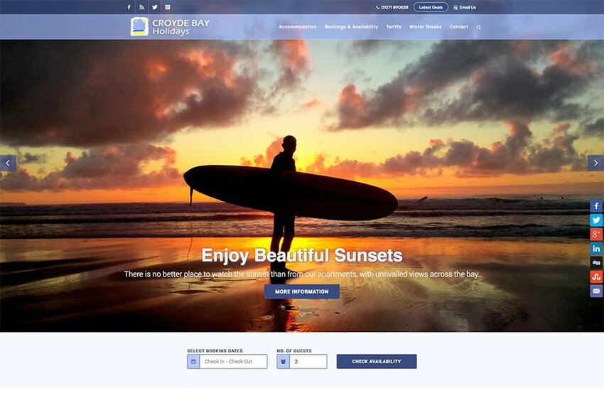
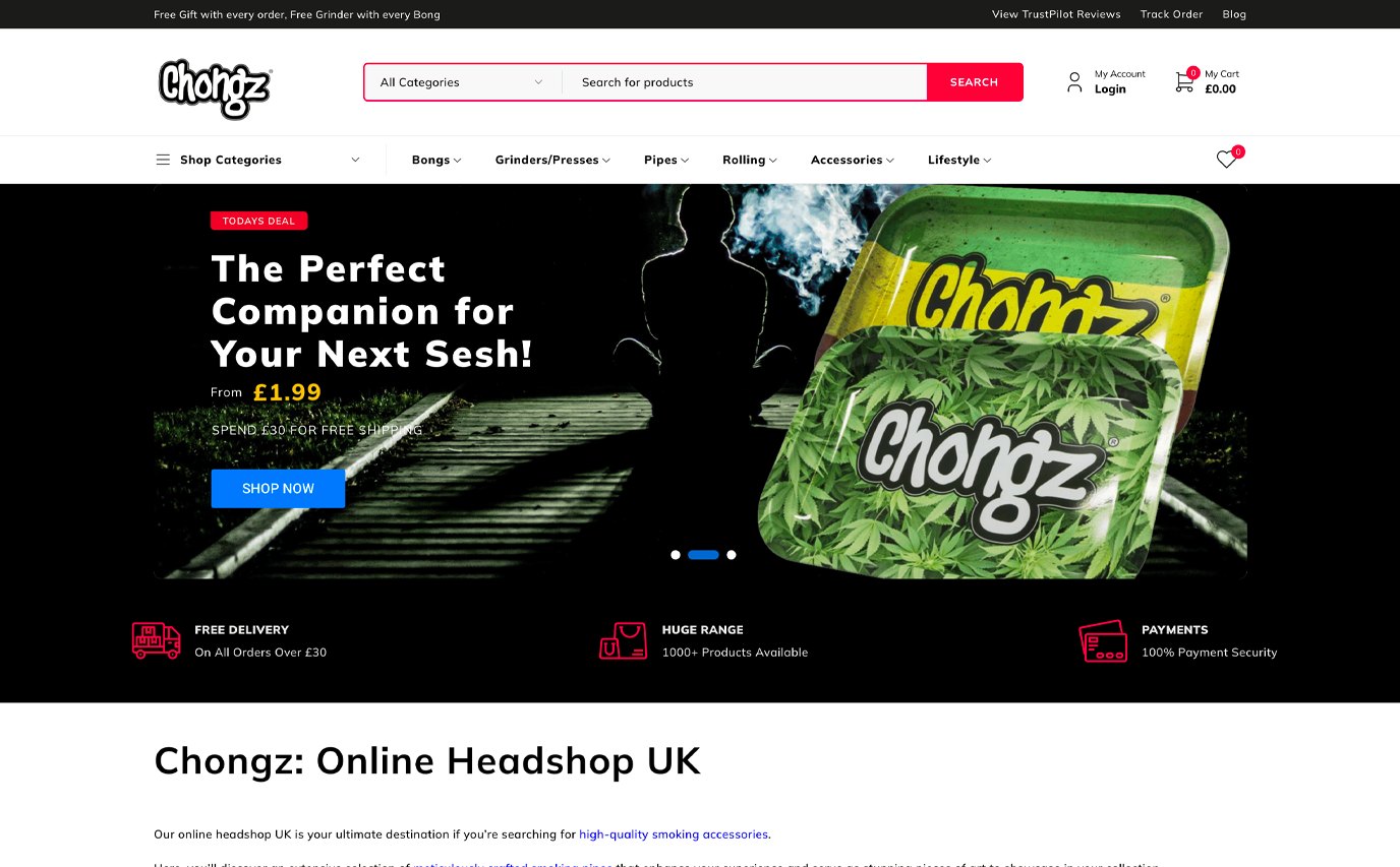
Recent Responsive Projects
Common Questions
Responsive Design FAQs
Let's Build Something
That Actually Works.
Book a free consultation. We will review your current setup, identify quick wins, and give you a clear proposal with fixed pricing. No obligation.