- Brochure WebsitesProfessional 5-10 page sites
- Web Design PackagesMonthly plans from £69
- Responsive DesignFluid layouts for every device
- E-Commerce DesignStorefronts built to convert
- Product PagesCatalogue & product listings
- Mobile DesignMobile-first experiences
- Landing PagesHigh-converting campaign pages
- Website Redesign
- Case StudiesReal client projects
- Retail & E-CommerceOnline stores & shop websites
- Professional ServicesLaw, finance & consulting
- Hospitality & LeisureHotels, leisure & food service
- Property & LettingsEstate agents & lettings portals
- Trade & ConstructionBuilders, plumbers & electricians
- Industrial & ManufacturingEngineering, logistics & manufacturing
- Web ApplicationsCustom business tools & portals
- E-Commerce DevMagento, Shopify & bespoke
- CMS DevelopmentCustom content management
- Database SystemsBespoke data solutions
- Mobile AppsiOS, Android & hybrid
- Sage 50 IntegrationAutomate your accounts
- SaaS PlatformsMulti-tenant applications
- API DevelopmentRESTful & GraphQL APIs
- Next.js & ReactModern frontend frameworks
- WordPressBuild, fix, host & look after
- Search Engine MarketingRank higher on Google
- Content WritingSEO-optimised copy
- ConsultingStrategic digital advice
- Logo DesignBrand identity creation
- Web HostingDedicated UK servers
- Email HostingProfessional mailboxes
- MaintenanceOngoing support & updates
- Security & SSLKeep your site safe
- Domain RegistrationFind your perfect domain
- Blog & InsightsTips, guides & news
- Free SEO AuditCheck your site health
- AI ChatbotsGPT-powered conversational AI
- AI Voice AgentsAnswer calls 24/7 automatically
- AI AutomationEliminate repetitive workflows
- Custom AI DevelopmentTrained on your business data
- AI IntegrationConnect AI to your existing stack
- AI ConsultingStrategy & honest AI advice
- GPT-4 & ClaudeLatest large language models
- ElevenLabs VoiceNatural-sounding voice AI
- RAG SystemsAI that searches your knowledge base
- CRM IntegrationHubSpot, Salesforce & Pipedrive
- Document IntelligenceExtract data from any document
- Private AI DeploymentYour data never leaves your servers
Mobile Web Design
We build mobile-first websites engineered for the small screen. Buttery-smooth touch interactions, sub-2-second load times, and layouts that look and feel perfect on every phone and tablet.
The Problem
Your Mobile Experience Is Driving Customers Away
Over 60% of all web traffic comes from mobile devices. Yet most websites are still designed desktop-first, then squeezed down. The result is a mobile experience that costs you customers every day.
Painfully Slow
Mobile users expect pages to load in under 2 seconds. Every extra second costs 10% of your visitors. We build sites that load fast even on a 3G connection.
Impossible to Tap
Tiny links and buttons that are impossible to tap on a phone frustrate users instantly. Touch targets must be finger-sized and spaced for thumbs.
Endless Scrolling
Mobile users do not scroll like desktop users. Poor mobile architecture buries critical content and forces users to hunt for what they need.
Battery & Data Hungry
Heavy pages drain battery and chew through data allowances. We optimise every asset so your site runs efficiently on any mobile connection.
What We Build
Mobile Experiences That Convert
Every website we build is coded mobile-first. Starting with the smallest screen and progressively enhancing — not squeezing a desktop site into a phone as an afterthought.
Mobile-First Layouts
We write CSS from the smallest breakpoint upwards. No hacks, no overrides, no afterthought mobile styles. Your mobile experience is the foundation.
Push Notifications
Swipe gestures, thumb-sized touch targets, and interactions that feel native. Your mobile site should feel like an app, not a shrunken desktop.
Location Aware
Offline capability, push notifications, and an install prompt. PWA features that let users add your site to their home screen and return without data.
Performance Optimised
We score 90+ on Google PageSpeed for mobile. Every image optimised, every script deferred, every byte counted. Fast on any connection.
Touch-Friendly UI
Google indexes mobile-first. We ensure your site is perfectly structured for mobile-first indexing with correct viewport settings and semantic HTML.
Mobile Analytics
Tested on 20+ real phones and tablets — iPhone, Android, iPad — across iOS Safari, Chrome, Samsung Browser, and Firefox.
Our Process
From Brief to Launch in Four Steps
- 01
Discovery
We audit your current mobile experience, identify every friction point, and map the user journeys that matter most to your customers on mobile.
- 02
Design
Mobile-first wireframes, touch-optimised UI, and layouts that work on every screen size. You approve every breakpoint before we build a single line of code.
- 03
Build & Test
Bespoke code tested on real devices. We run Lighthouse audits on every page and iterate until every mobile score is 90+.
- 04
Launch & Support
We deploy your mobile-first site and monitor performance. As new devices hit the market, your site continues to perform perfectly.
"approach": "Mobile-First",
"breakpoints": [
"375px",
"768px",
"1024px",
"1440px"
],
"framework": "Next.js 14",
"css": "Custom + Tailwind",
"testing": "20+ Devices",
"performance": "Sub-3s Target"
}
Our Work
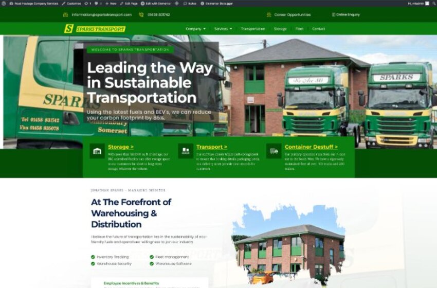
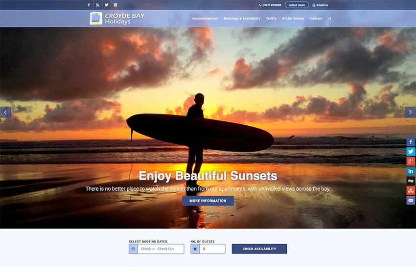
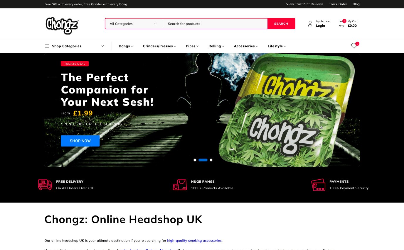
Recent Responsive Projects
Common Questions
Mobile Design FAQs
Let's Build Something
That Actually Works.
Book a free consultation. We will review your current setup, identify quick wins, and give you a clear proposal with fixed pricing. No obligation.